

Illustration Friday :: Resolve
Color version (click image for larger version)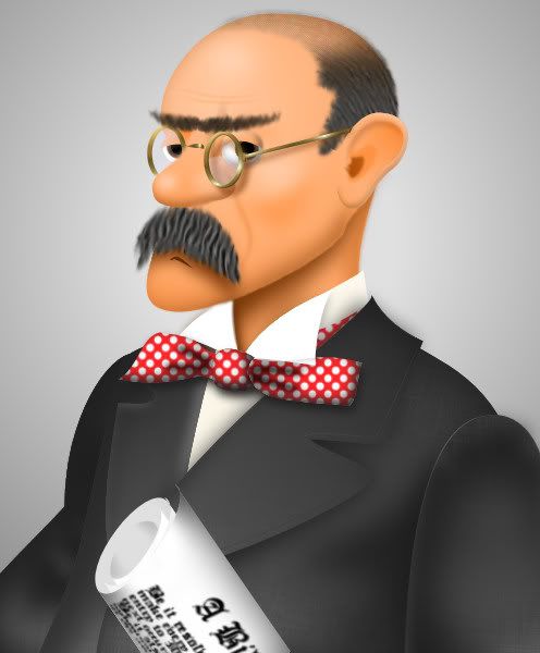
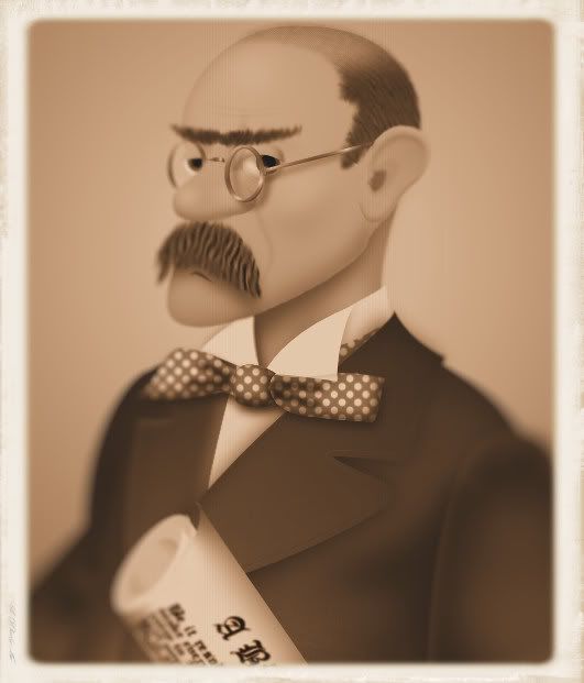
B&W 'daguerreotype' (click image for larger version)
Be it resolved....
This image is not of anybody in particular. It represents a stereotypical mid-to-late 1800s politician. The image is based on this photo of Maryland politician William Pinkney Whyte. (A great name for a politician)
I couldn't decide which version if the illustration I liked best, so I decided to post both.
Which do you like best?
Click image for larger size.
Digital Image :: Corel Paint Shop Pro Photo XI v 11.2
( Click here for entire blog )
![]()


25 comments:
Very nice, I like the color version a little better, I think it shows more detail. I do like the other also. Great job!!
The expression is so well captured. I enjoyed both versions.
I really like the old-photo-looking one. Looks maybe a bit too clean (could use a texture slapped on there or something) but it's really nice. And you've got some really nice character to his face.
Usually I'm all about the sepia, but the red and white polka dots got me this time. :)
Thanks for visiting my blog, and, yes, that's my son, Aaron singing.
Di
what brilliant images, you are very accomplished with the paint package you use. As you asked for an opinion I prefer slightly the colour-couldn't tell you why! thanks for stopping by.
anyone can see that a great technique and effort was put into this piece. great job...
I love the sepia-toned version - his eyes pop better for me and the softness around the body and edges just adds focus to his 'resolved' expression.
I love both of these illustrations He is such a character! he he he he! This is wonderfully illustrated. Great play with the word! Clandestine reminds me of my daughter! I love this one too. Thanks for stopping by.
they both have their charm, but I think the color one is my favorite :)
he seems very resolved, too!
I love the old version, I like the antic sensation. Happy 2009!
Looks like the comments are split pretty evenly, but I'll go with the color piece of ol' W.P.
Great 'stache... Really adds to his resolve.
Love the portrait. I think the b/w really captures the time
Excellent rendering on the comb-over, and the mustache... the unibrow cracks me up. Nice work!
i think his moustache is kinda yummy. i wish more men wore those these days.
I like them both equally. The thrust of the chin and the body language say a lot about resolve!
Really awesome Larry! i love em both!!! Great mustache :) Happy 2009 to you!
since he's from the 1800's I like the sepia version better, but they both look good. michael dailey
He looks more like a determined lawyer than a politician but I imagine he could be both! Very nicely done in both illustrations. As a color junkie, I lean towards the guy in the red and white bow tie.
Both!!
The sepia one is vey vintage looking
thank you, larry, for your comment on my blog. i truly appreciate. no idea, whether you have seen my comment in italics i added only a few minutes ago. i fear the worst in terms of comments and ignoration, to be honest :-(
i like your stuff, i must say! i admit i do not have the faintest idea about digital illustration, i am just a silly analogue colour splasher ;-)
e.
Cool illustrations! I really like the 3D style you have! :)
i think i like the color one best (if for no other reason than his amazing red polka dot bow tie) :) both are great though!
I love them both...he is just crying out to be an animation! What fantastic work...I never knew such things were possible on paint shop pro.
Thanks for stopping by my blog!
I prefer the second one. Look old and mysterious. It seems to me like there are some stories behind it, waiting to be resolve.
Bye the way, thanks for stopping by.
I enjoyed seeing the reference photo and what you took from it is great take, perfect! I like the sharpness and clarity in the color one best.
Looks maybe a bit too clean (could use a texture slapped on there or something) but it's really nice. And you've got some really nice character to his face.
Post a Comment